Sunflower CMS Navigation System
Design menu navigation elements that will work for large and small websites within a content management system.
Client: All website content creators in KU’s content management system
Team:
Design: Dave Gnojek, Patrick Giroux, Audra Kenton, Summer Foster
Development: Bill Kummerow, JD Warnock, Chris Welchaans, Susan Patton
My role: User experience designer
Date: 2020
Background
The CMS had not be redesigned for eight years. Eight pivotal years in web design usability and trends leaving it feeling very dated and often ended up breaking.
The previous menu navigation was designed without consideration for mobile devices and did not function well.
The previous design was a horizontal bar across the top of the page that often did not fit the top level items that users wanted to put there. There was no overflow design to account for longer text.
Key problems
There are over 500 websites that run on The University of Kansas content management systems (CMS). These websites have a huge spectrum of needs for their respective audiences. Some websites like the Human Resource Management house functional content and have many levels of hierarchy in the information architecture. Others like the Undergraduate Admissions site may have a much shallower navigation structure and houses marketing-focused content. Our challenge was to design a navigation system that met the needs of all sites in the university’s CMS.
We needed to find a structure that supported for very small sites to mammoth sites and lends itself well to responsive design , meets accessibility standards, and delivers a straight-forward and familiar model.
Discovery
During our discovery phase we organized stakeholder workshops to learn more about how content creators at the university think about their audiences, websites, site structure, and the needs that navigation plays in helping end users get to the right place.
Through competitive research we learned that there were a few broad ideas that most navigation structures fell into: dropdowns, mega-menus, full-screen takeovers, and sidebar accordions. Concept ideation steps included a lot of hand-drawn sketching and conversation, wireframe mockups, and user feedback sessions to learn how our users understood and responded to the top concepts.
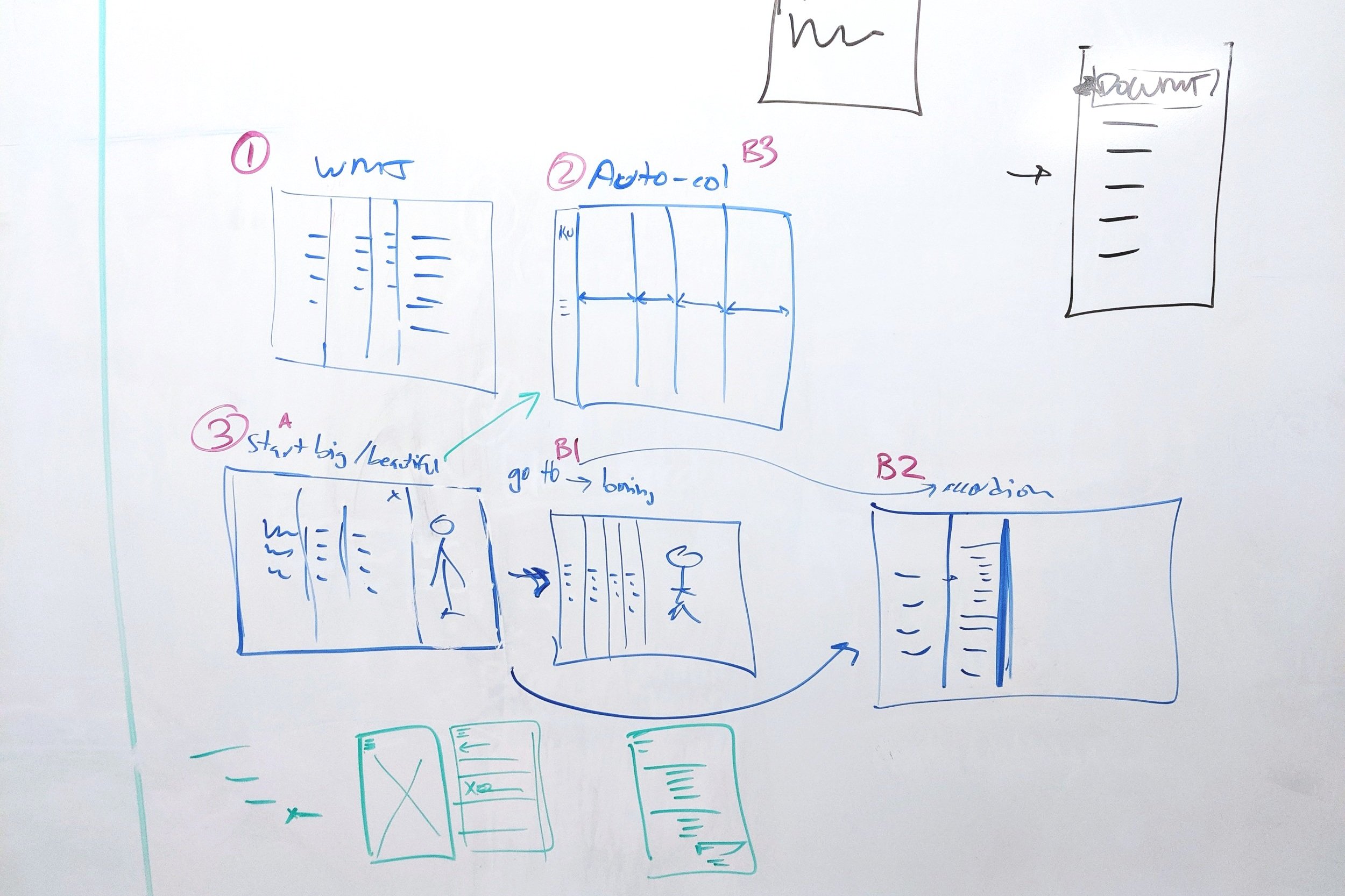


Refining designs
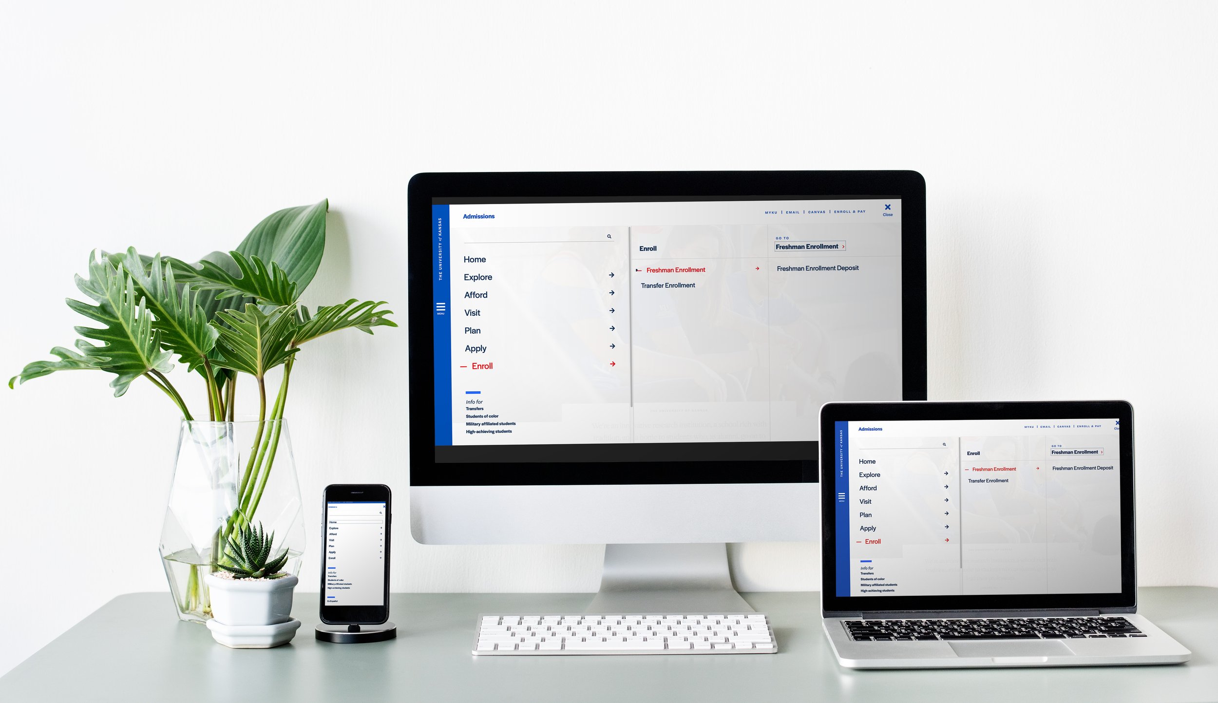
After testing and evaluating many navigation mockups we landed on a final direction, a takeover menu with columns built for flexibility. This design allows room for a typographic view of menu options and progressive disclosure of options to keep the user from decision fatigue. The column structure supports scrolling for websites with a broad architecture and creates a smooth transition to mobile devices screen sizes.


Mico-interactions
Levels of the navigation structure are treated like cards that stack on top of one another with a subtle sliding motion that helps users visualize the structure of the site.
Header transition
On the mobile view, the header bar and navigation menu get out of the way of the content, but are there when you need them. As you scroll down the top bar disappears and it comes back on scroll up to help you find what you are looking for.
Nav bar fade
On desktop screen sizes, the navigation bar on the left side is always there. When the page loads it is blue and draws the eye to the bar and the menu icon. As the user scrolls the bar transitions to grey where is takes a step back and allows that content of the page to hold more attention.
Key insights
We would not only need to redesign the main menu navigation but also provide other structures for navigation within the site.
Better search functionality and interface
Secondary navigation
Breadcrumbs
Header and footer
A collection of in-page navigation elements, such as:
Sidebar content types
Accordions
Pagination
Tabs
Links lists
CTAs
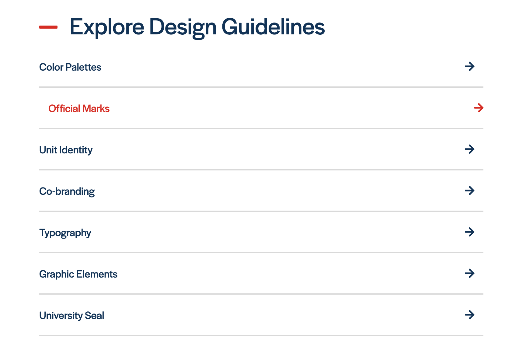
In-page navigation structures

Footer: Choice between 3 brand colors to suit the design of your site. Departmental list of links, address, and social links are customizable. Nondiscrimination statement and legal statements are in an expandable dropdown.
Clearinghouse: Used to help drive the user to subpages of the site without opening the nav. The link list is also ideal for next steps content. Works well near the bottom of the page.

Sidebar link list: This list is ideal for 7 links or less related to the content within the body text that it lies next to.

Accordion: The accordion is used for collapsing certain content under a header. This block works well when the user wants to quickly scan for a relevant topic, when your page content is longer than desired, and for FAQs.
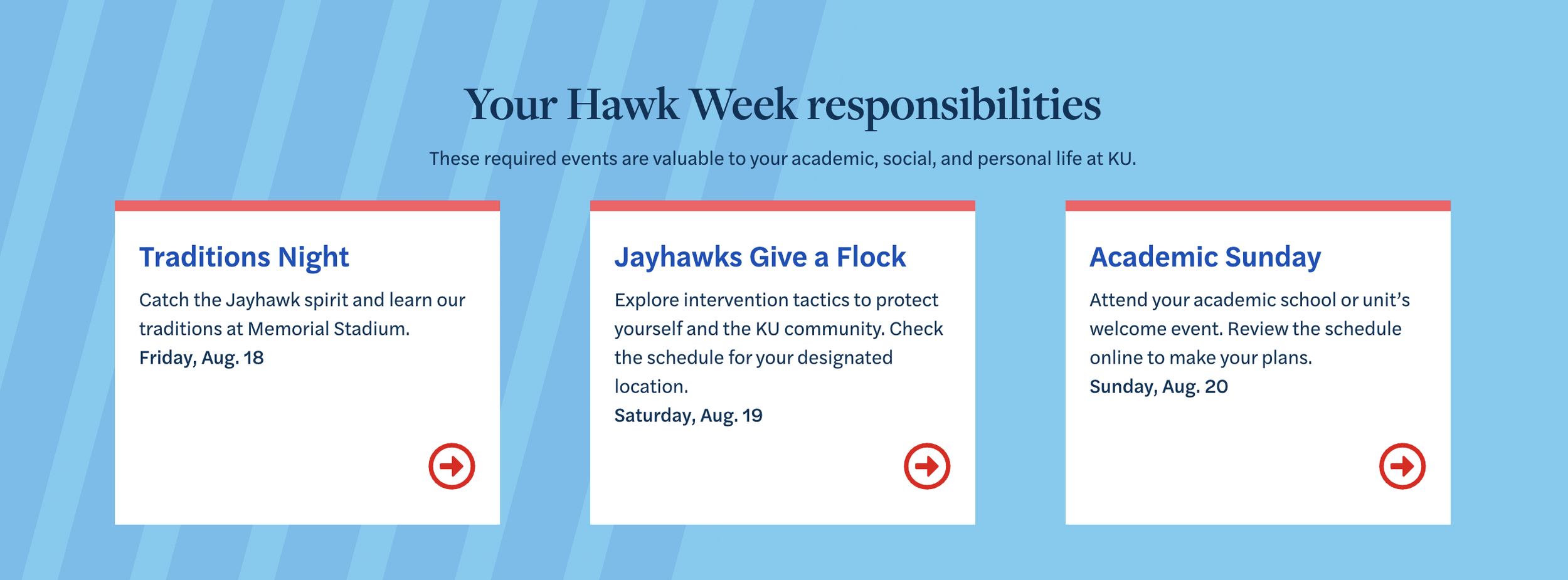
Call to Action Cards: There are several CTA in-page navigation options to choose between to help drive action to some key areas of your website.

Link List: On occasion there is a need for a giant list of links. This section allows for clean organization of those links.
Header: The header design is simple and allows the unit to put their name front and center with their parent unit in smaller type above. "The University of Kansas" is out of the way but still prominent in the blue Navigation Bar. Search is minimal and in the upper right as you would expect.
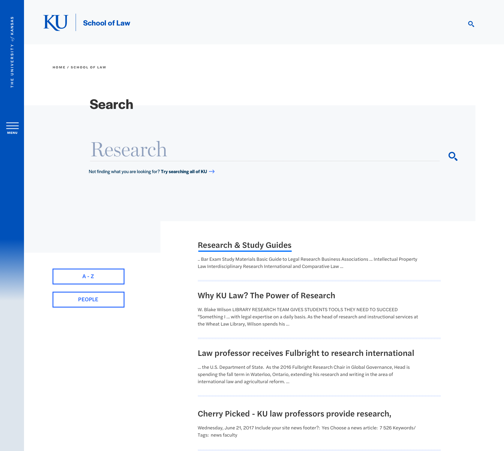
Search: using the search bar in the upper right of every page or from the search bar within the takeover navigation menu will land on the results page
Delivery
After the navigation menu and supporting elements were designed, tested, and refined it was time to deploy. The navigation was launched at the same time as the full CMS redesign and there were several tools along the way to help users work in the the system. We provided:
Guidance on organizing your site, creating a sitemap, and how to build your navigation
We also presented the new navigation designs to content creators across campus.
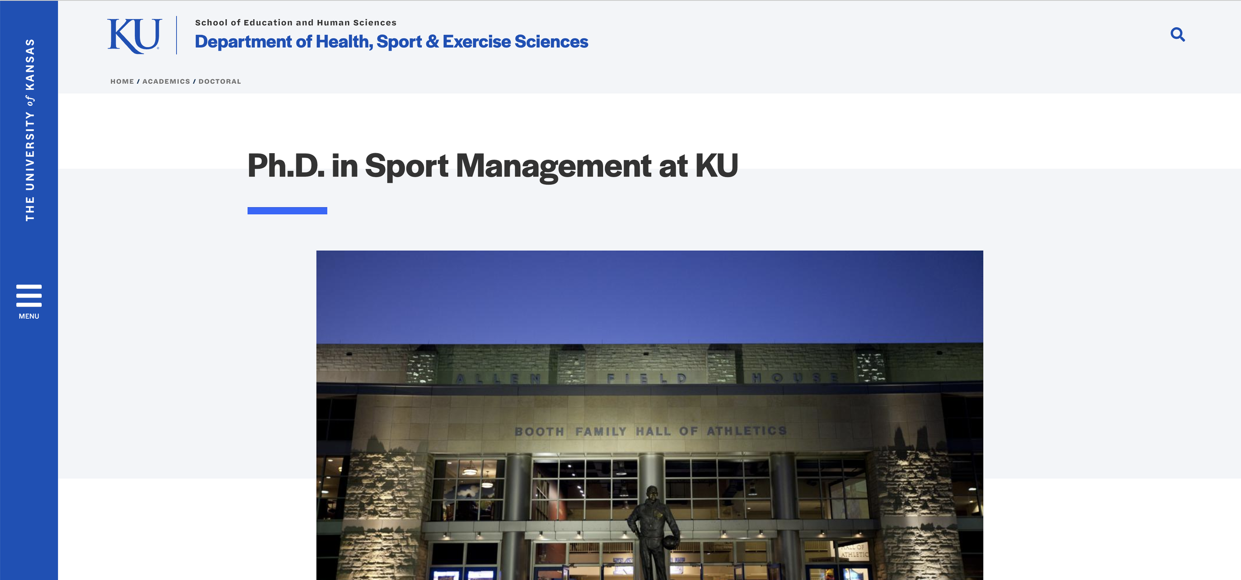
The navigation system lives on hundreds of live sites, here are a select few: