CMS Redesign
Redesign the content management system for The University of Kansas
Client: The University of Kansas
Team:
Design: Dave Gnojek, Patrick Giroux, Audra Kenton, Summer Foster
Development: Bill Kummerow, JD Warnock, Chris Welchaans, Susan Patton
My role: User experience designer
Date: 2020


Background
The University of Kansas has over 500 sites that run on the CMS platform. Prior to our redesign, named Sunflower, the CMS had not been updated in any significant way in eight years. During those eight years, the world of the web changed significantly, especially in mobile design.
The KU Marketing Design team and IT Web Development teams worked together to completely rebuild the system. All KU sites ran on Drupal 7.0 which was reaching end-of-life for product support. As a result, all sites would need to rebuild on the new CMS platform which would run on Drupal 9. Since everyone needed to manually migrate their sites, we determined it was the ideal time to introduce a new design system and web standards.
Key Challenges
-
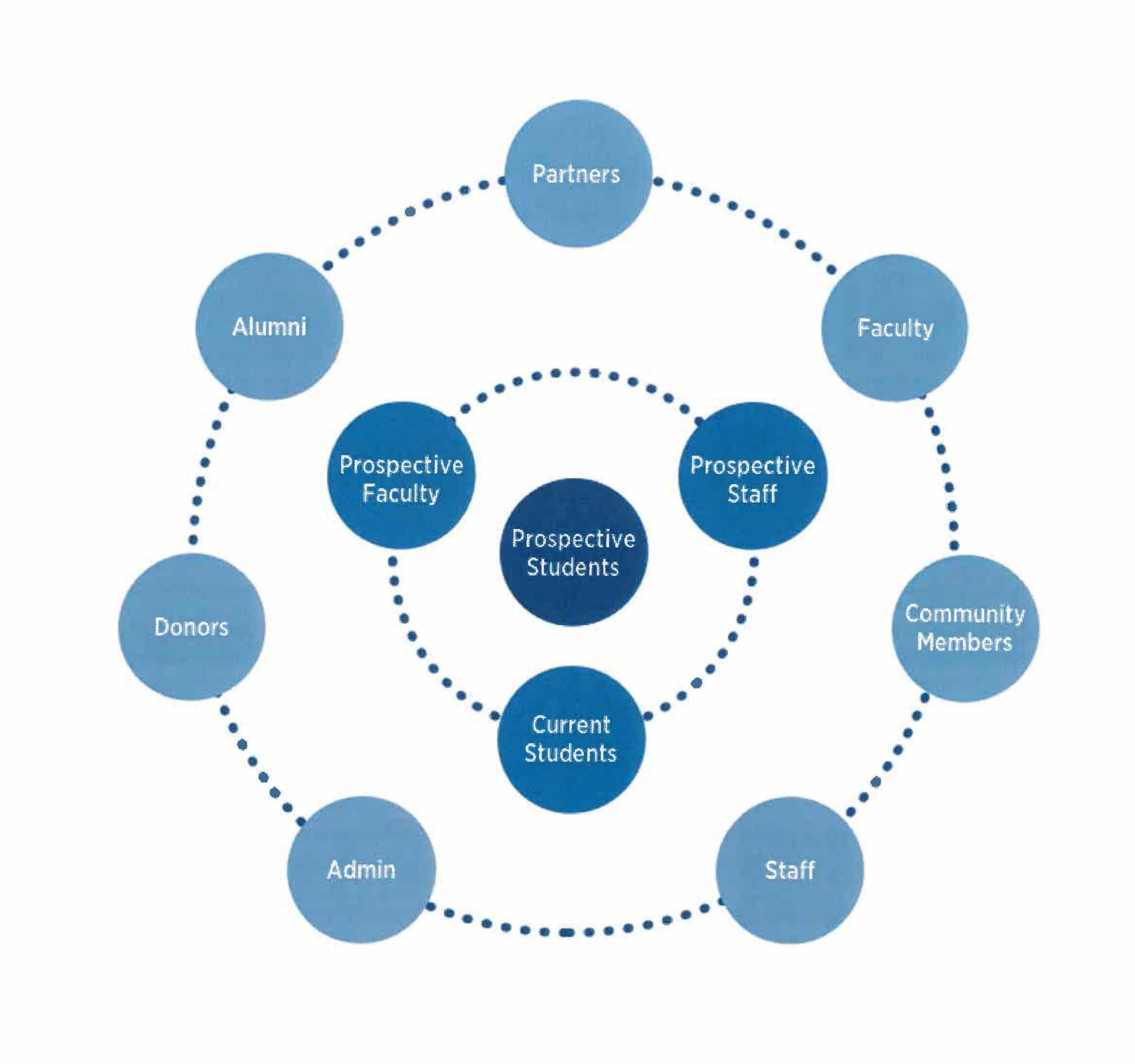
The CMS supports websites that have very different content needs and audiences. Websites can include professional schools, administrative offices, departments, research centers, affiliates, clubs, and more.
-
When the previous version of the CMS platform did not meet the content needs of the users, they often made new elements that were not a part of the system. As a result, our network of websites had many inconsistencies and didn’t feel like a cohesive entity.
-
Units are often under-resourced and it is common for the website creation and maintenance tasks to be tacked on to someone’s job that is not related to what they are trained to do.
UX Requirements
-
The platform needs to support all web design skill levels, primarily entry-level.
-
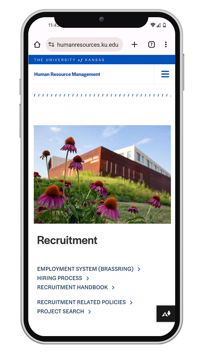
We know that our audience consumes information through a variety of channels. Our designs must work well and look good on all screen sizes.
-
Our designs will be held to a high standard in accessibility and best practices should be considered at all stages of the design and testing process.
-
Sunflower CMS will showcase a flexible and cohesive design system. We will organize our design system in a way that is built for growth in this platform and other design work.
-
Our designs will be coded in a bootstrap framework and we will organize our grids and responsive design to fit those standards.
-
We will seek feedback and test out ideas with our community. Additionally, we will help guide them through the site change processes.
We needed to build a suite of easy to use content sections and design elements that work well together in any combination.
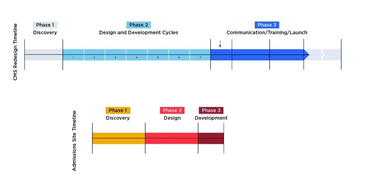
Discovery
The CMS redesign was a large initiative for the university. With careful planning we laid out steps that would be taken for our discovery research, defining the problems to tackle, design and develop cycles, and delivery of the system including launch timelines and campus communications to guide users through the process. It all started with a planning session.


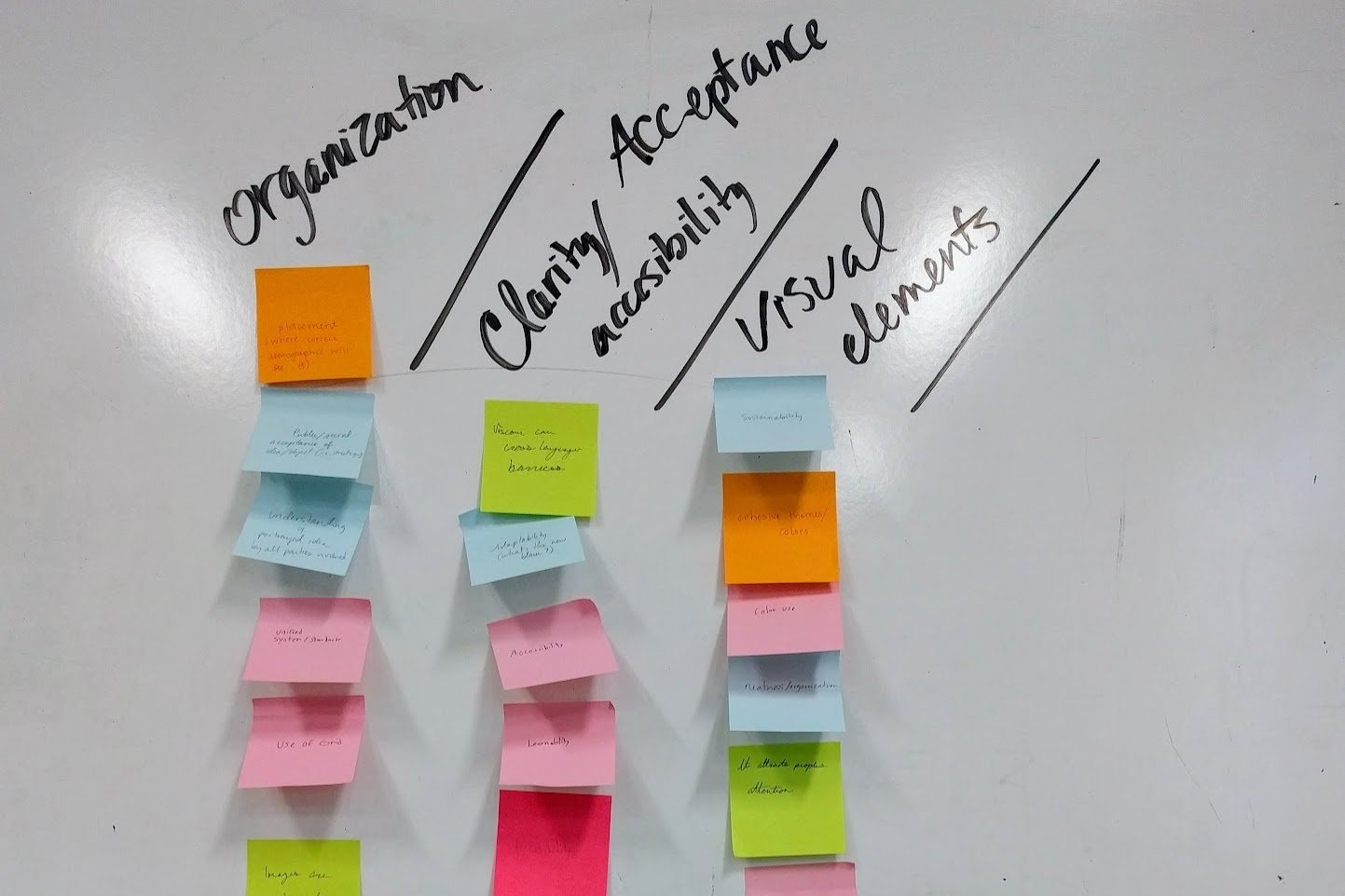
After our planning sessions, we dug right into competitive research. We investigated other higher education websites, looking for excellent examples of modular sites and design systems. We evaluated each site based on:
Navigation
Modular design
Brand consistency
Image / video use
Mobile views
Typography
Content strategy
Next, we organized stakeholder workshops to learn more about how content creators at the university think about their audiences, websites, site structure, and the needs that navigation plays in helping end users get to the right place.
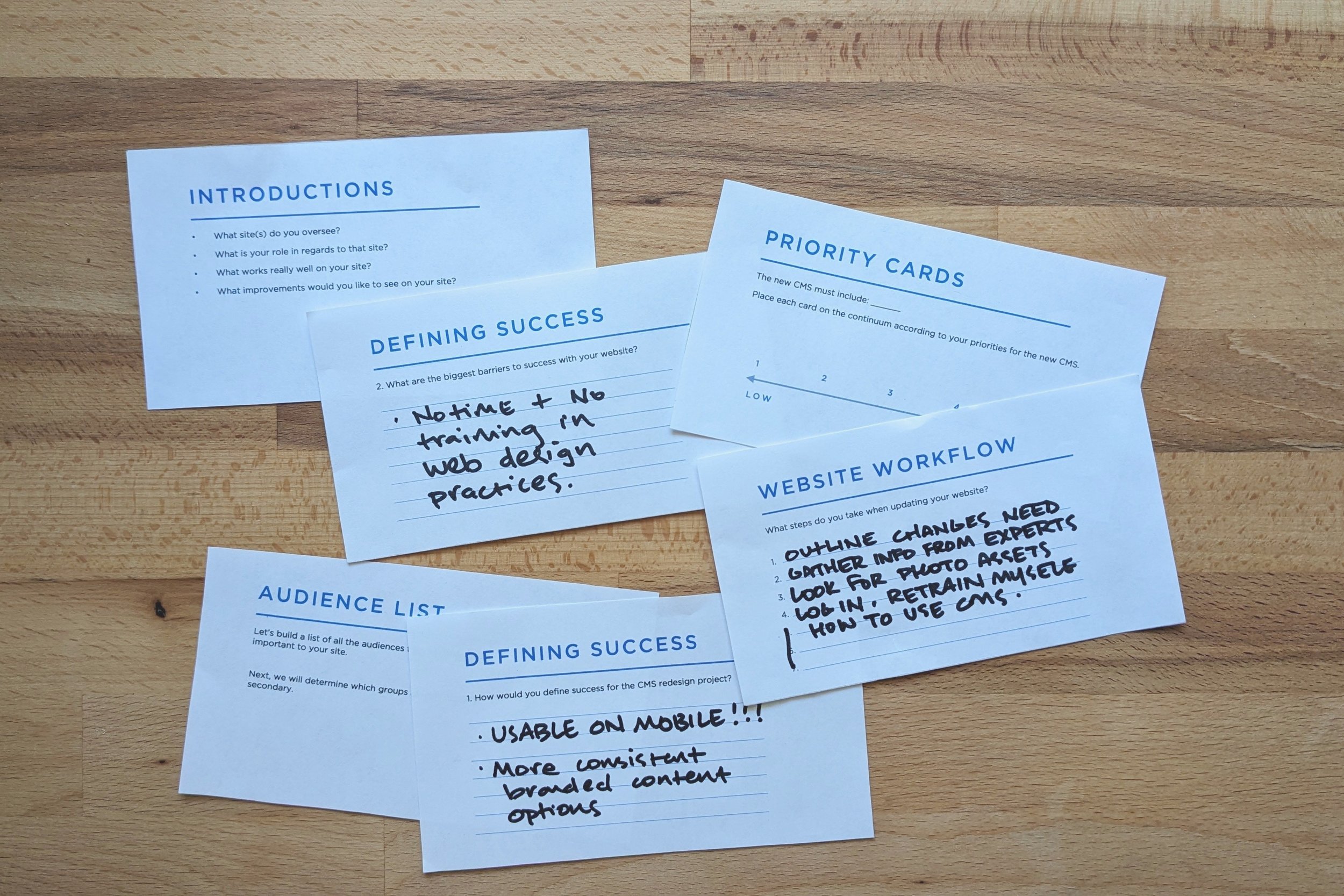


Key insights
Templates:
To accurately design useful CMS sections for higher education we needed to use our research to build common templates. Those templates served as guides to content strategy.
Atomic design system:
After researching design system methods, we determined that the Atomic system was a model that was a good fit for our design and development needs and set us up for long-term growth.
Curated customization:
We needed to find a balance of allowing users to make customizations to their sites without creating brand inconsistencies, accessibility issues, or design and development complications. We needed to design several approved options so that users would have flexibility without having to do it on their own.
Agile development cycles:
We decided to break up the work into agile design and development cycles that were based on the content needs identified.
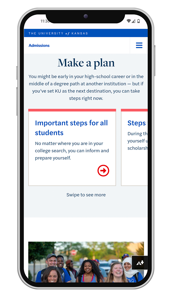
Pilot site:
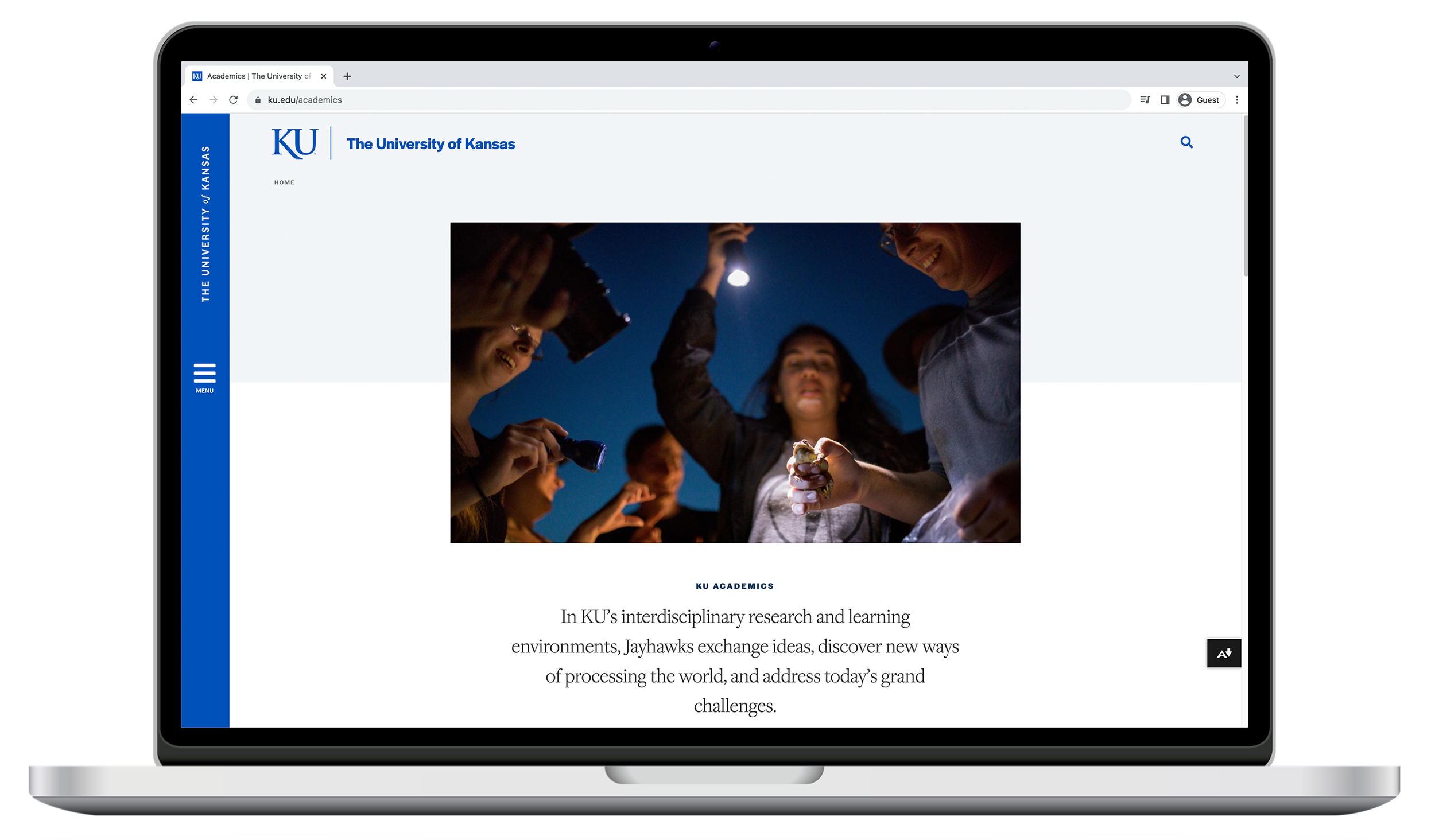
We determined that our development cycles would benefit from working directly with a pilot site. That site would also serve as an example when announcing the CMS to rest of KU community. The pilot site, admissions.ku.edu, launched at just as we let early adopters into the system to begin working.
Concept development
Concept development happened in cycles based on the major initiatives we knew we would need to tackle, including design system core elements, navigation systems, header and footer options, image and video displays, grid and body content options, call to actions, template organization, and more.
Through each cycle we held team discussions, created lots of mockups, reviewed and refined until we landed on a suite of “sections” that would be offered in Sunflower CMS.


Navigation
Navigation menu design is vital to the success of the CMS redesign. To see the full story of Sunflower navigation, view the case study.
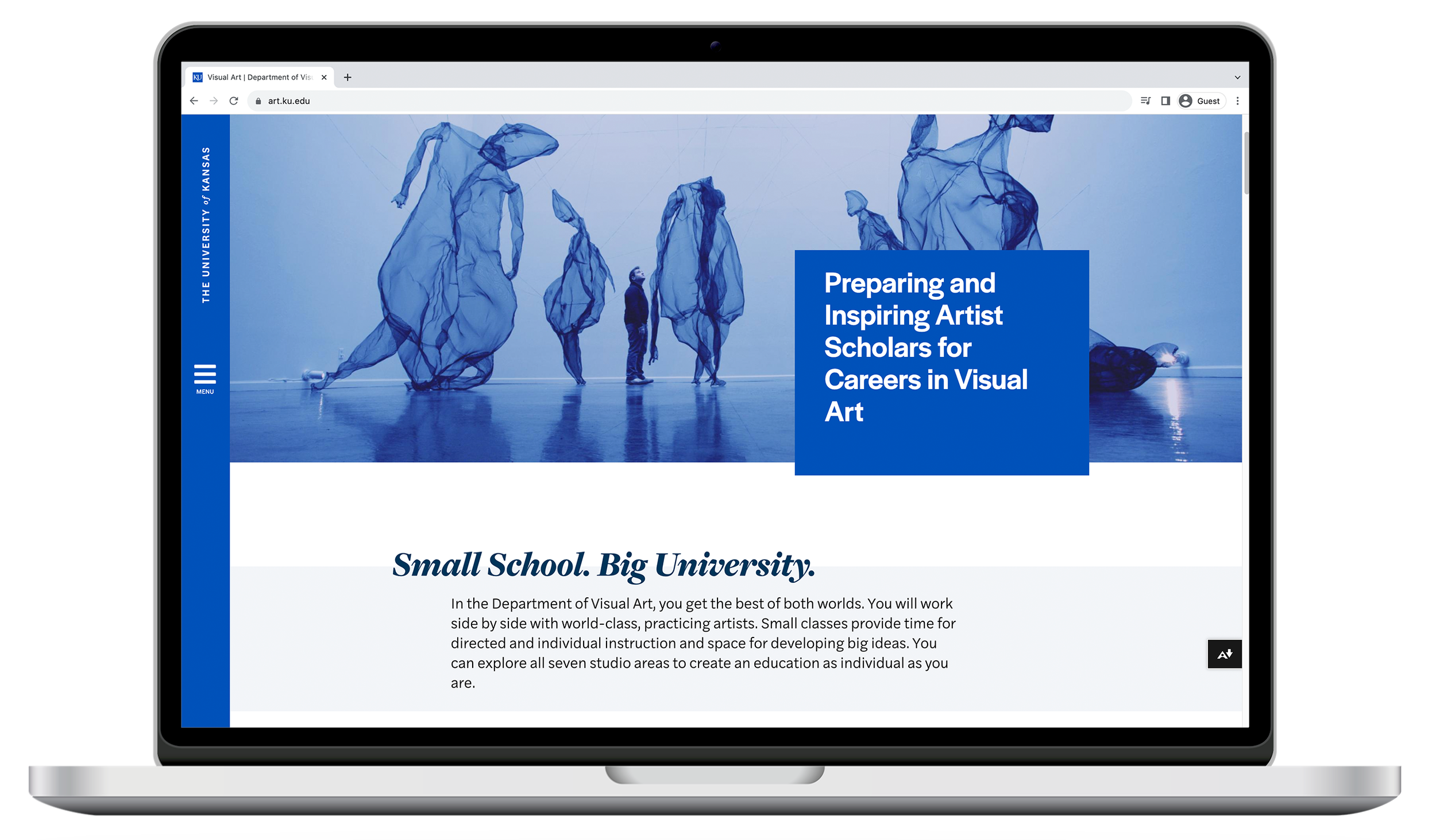
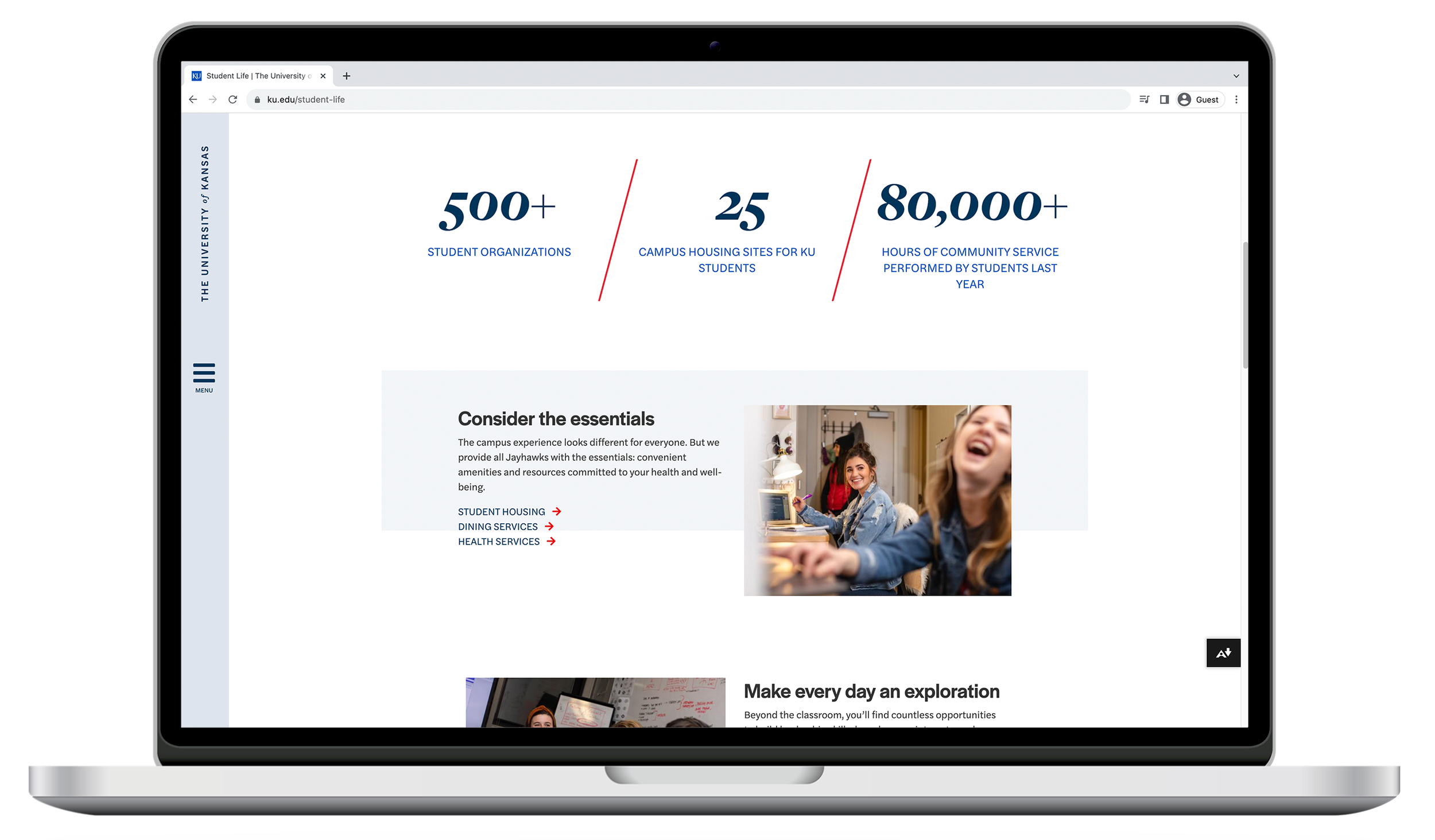
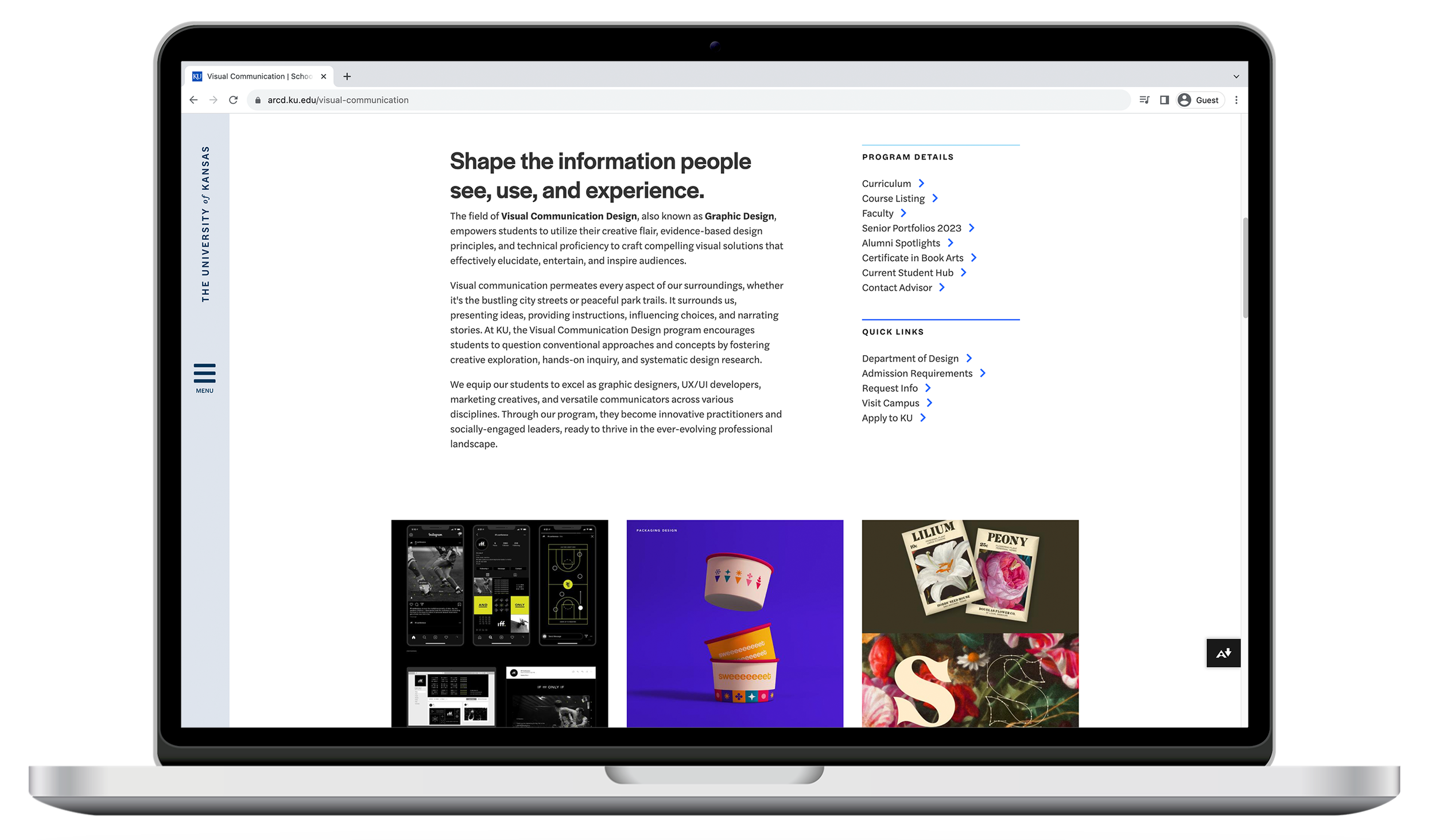
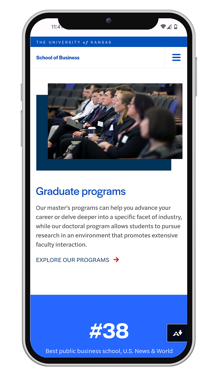
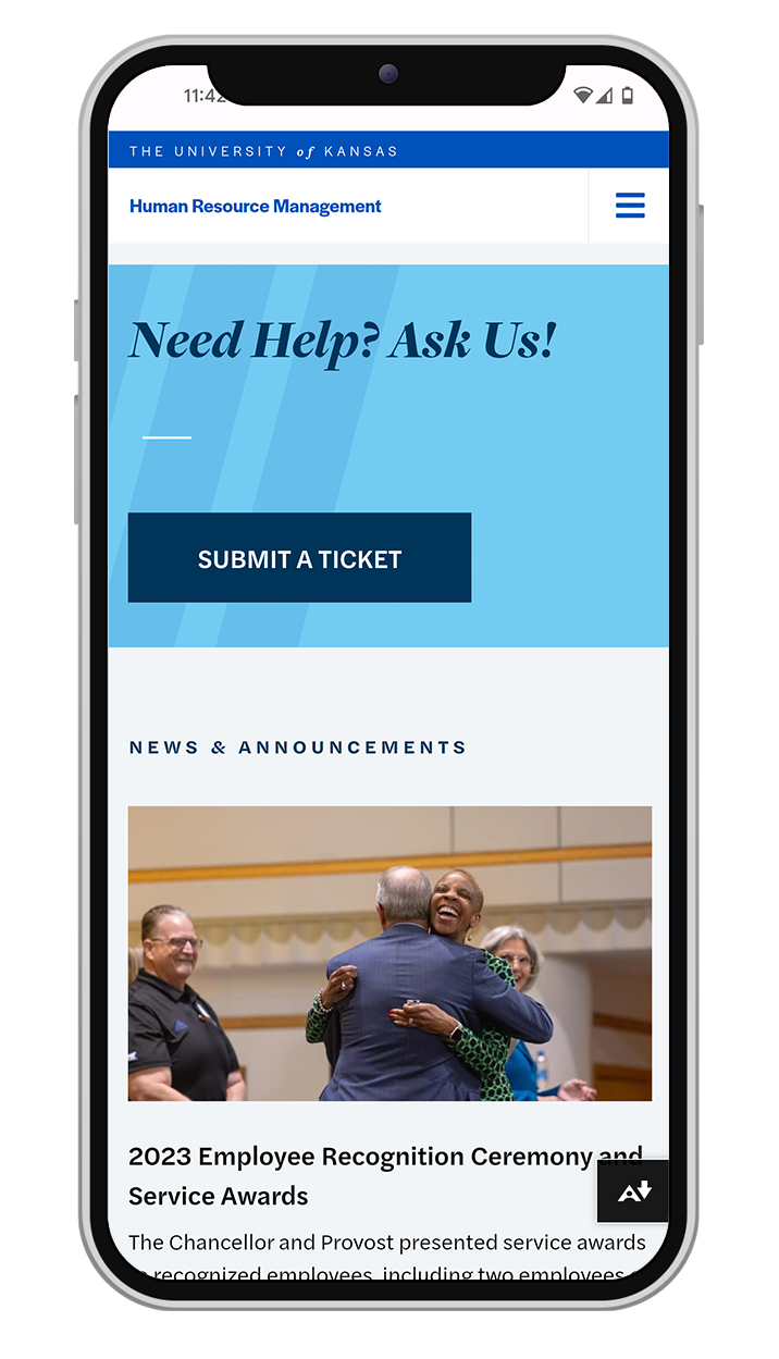
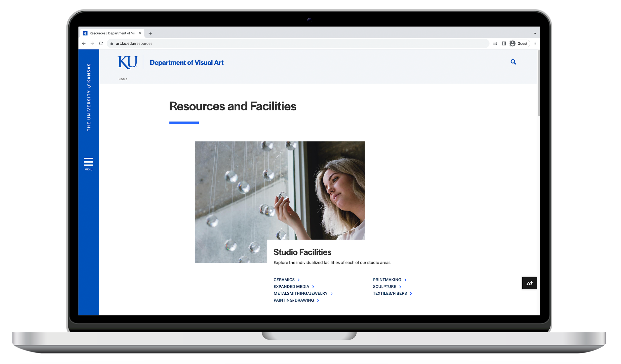
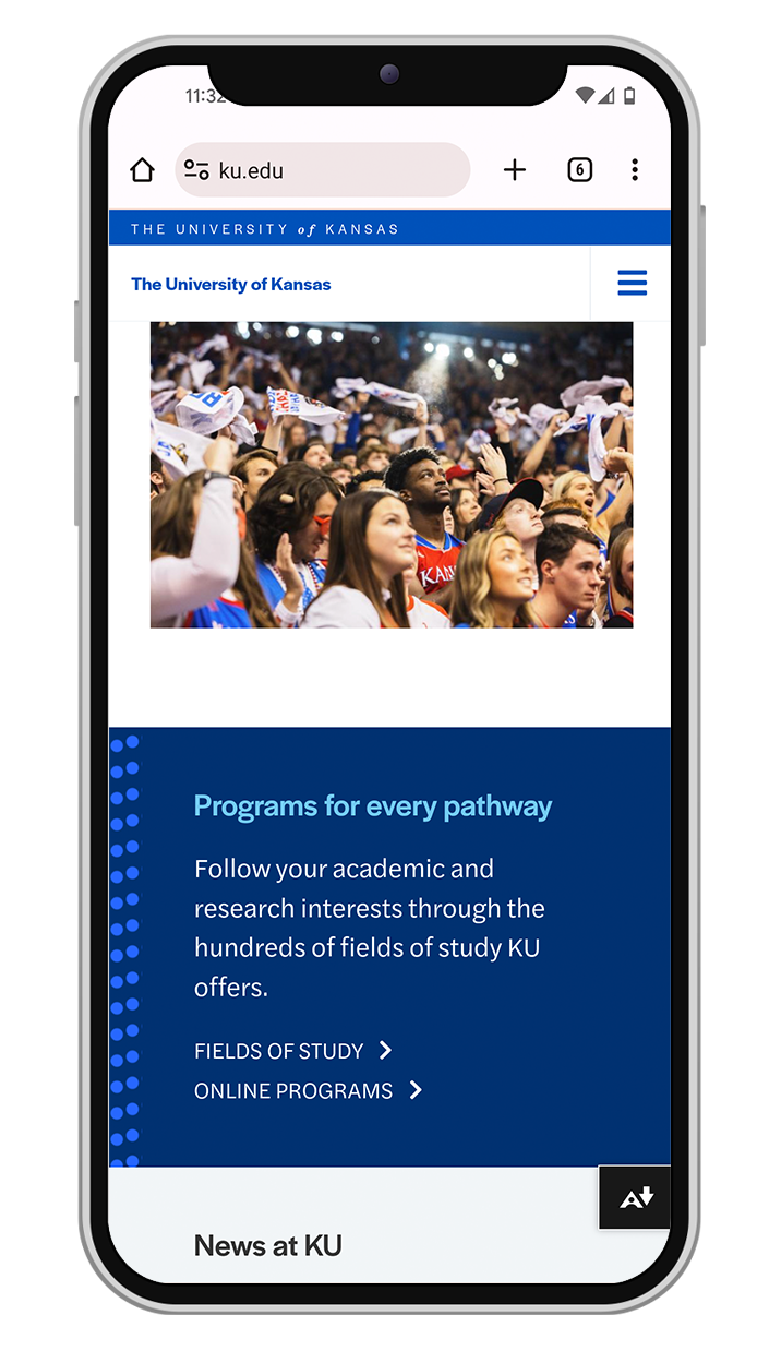
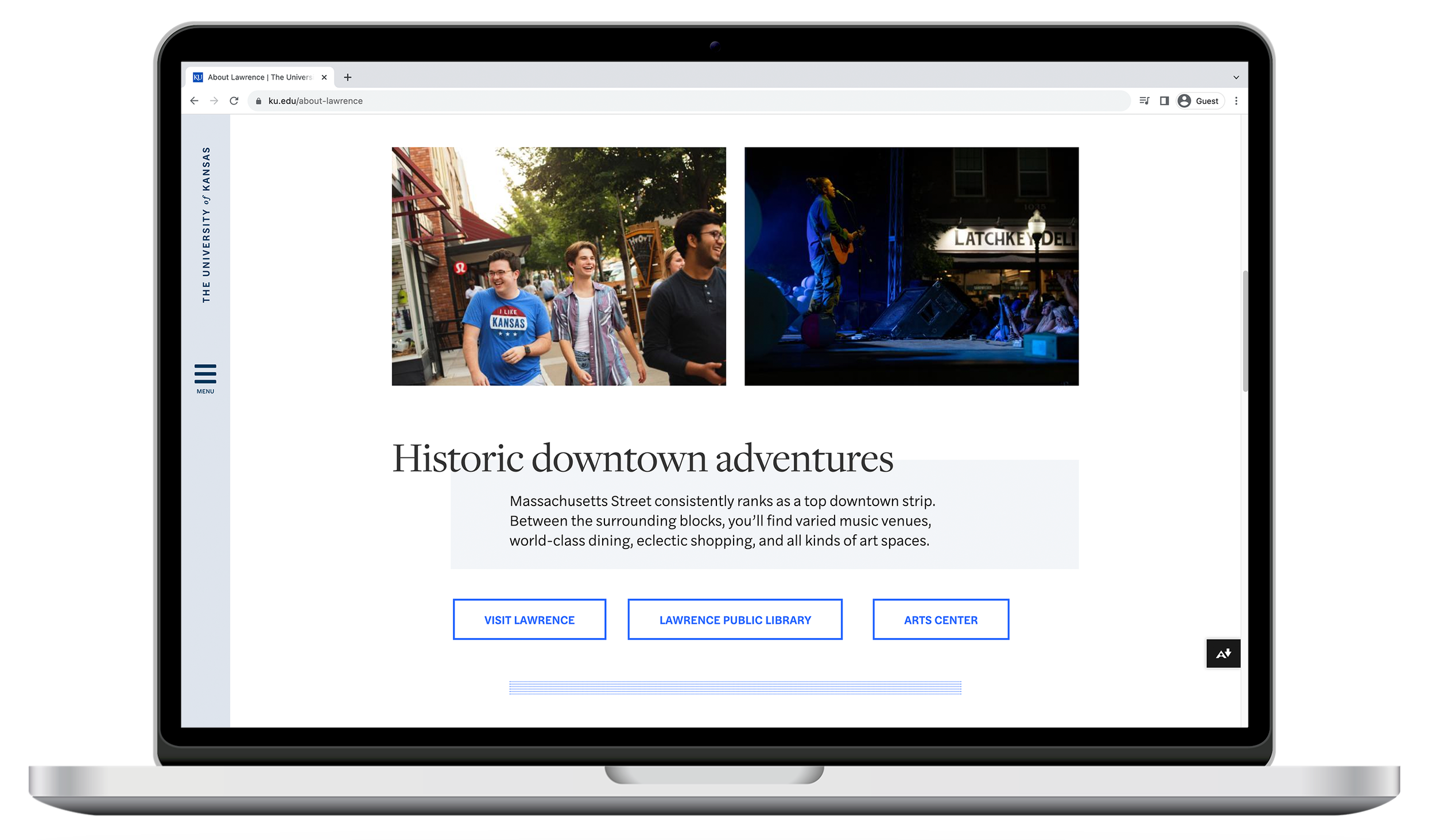
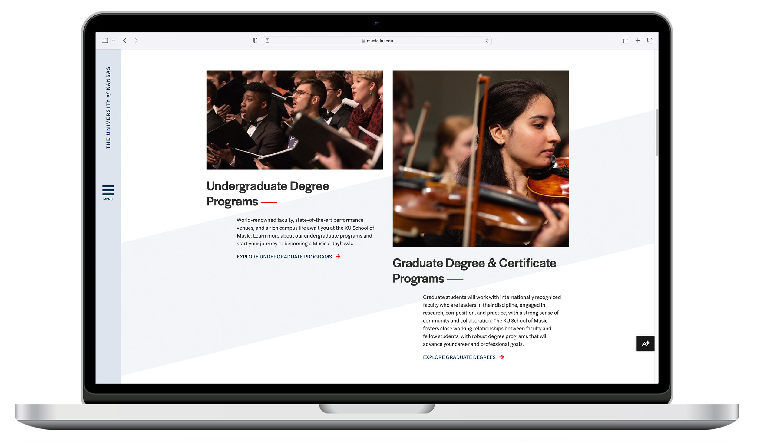
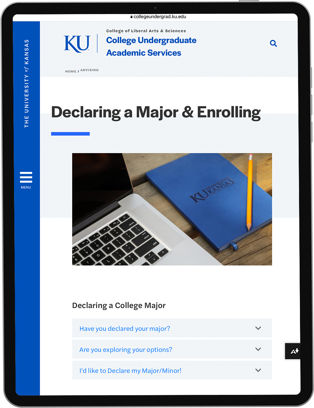
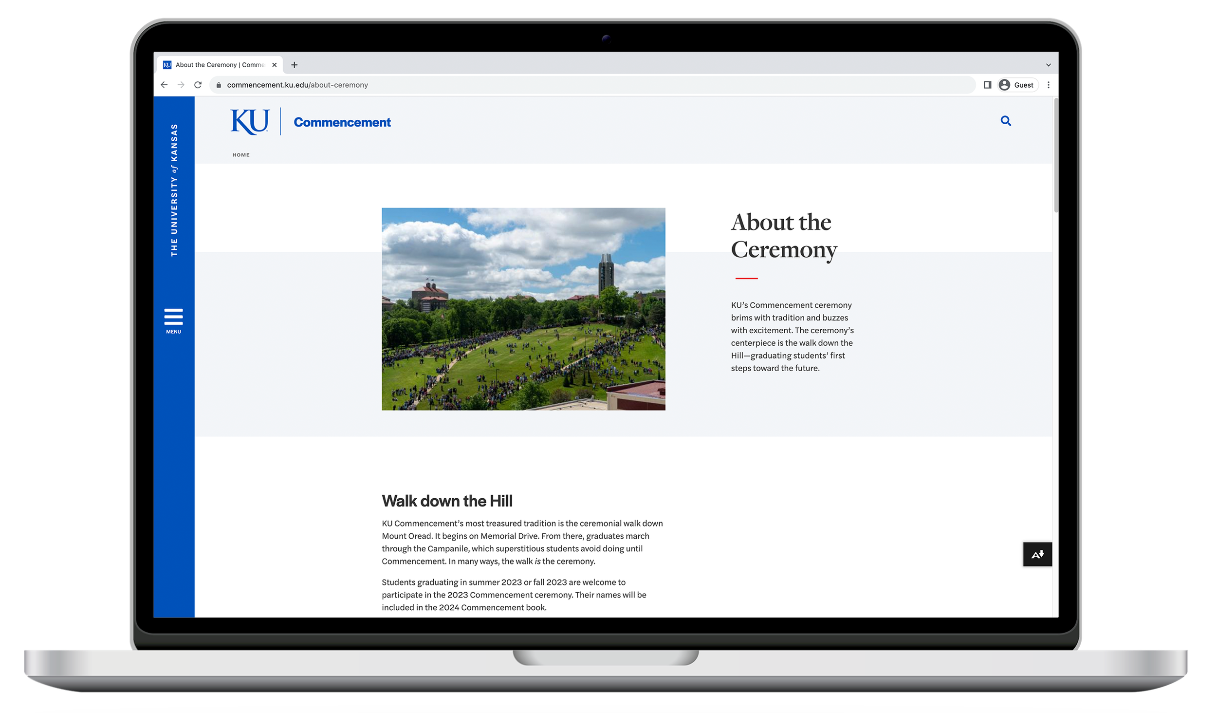
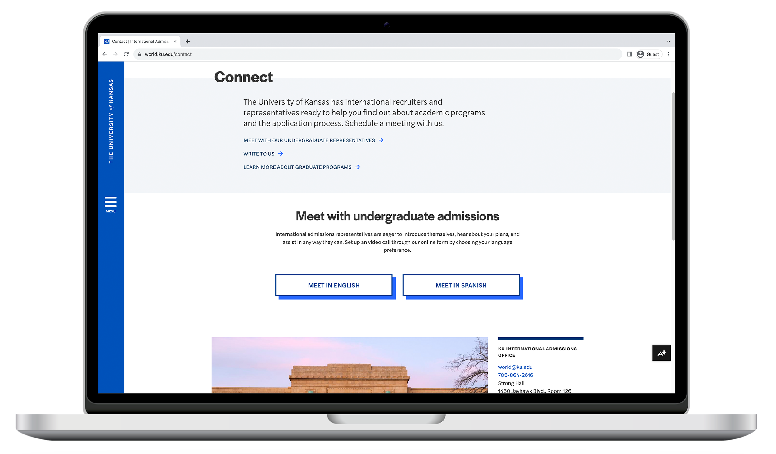
Sections and templates
After many iterations of concept mockups, evaluation, and refinement we landed on a system made up of sections and templates.
Sections are content blocks in the CMS that can be customized in a few key ways.
Templates address common content needs for the university and are made up of a collection of sections.
Users can build pages with templates or create more of a DIY page by using any sections in the system.
We broke all of the sections into categories so that the user can quickly find the best section for their needs.
Headers - 10 sections, each customizable
Body - 22 sections, each customizable
CTA’s (call to action) - 6 sections, each customizable
Image displays - 8 sections, each customizable
Events - 3 sections, each customizable
News - 3 sections, each customizable
Lists - 8 sections, each customizable
Footer - 1 section, customizable